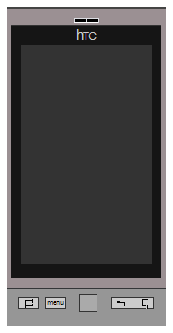
HTC Desire in CSS3 – Part 3

February 11, 2011

(Back to Part 1, Part 2)

The Small Details

..~%~..~%~.. Intermission ..~%~..~%~..

Let's briefly play with another new bit of CSS and also see the advantages of getting the browser to do the graphics for us.

Hover over the phone - if you're using Webkit (Chrome, Safari), Firefox 4 beta, or Opera (creaky but just works).

.phone12 { -moz-transition: 0.5s ease-in; -webkit-transition: 0.5s ease-in; -o-transition: 0.5s ease-in; z-index: 2; } .phone12:hover { -moz-transition: 0.5s ease-in; -moz-transform: scale(1.5) translate(120px, -20px) rotate(-90deg); -webkit-transition: 0.5s ease-in; -webkit-transform: scale(1.5) translate(120px, -20px) rotate(-90deg); -o-transition: 0.5s ease-in; -o-transform: scale(1.5) translate(120px, -20px) rotate(-90deg); }

This uses CSS to scale up our phone div (and move and rotate it, just for fun). Of course this happens to any kind of content inside the div being transformed - images, tables, whatever - but here, notice particularly how our curved borders, box shadows and gradients all get nicely scaled up by your browser (you may be able to see it re-rendering).

Fun, although implementations are a little buggy right now. For more: CSS3 Transitions at A List Apart, and CSS3 Transforms at 24 Ways.

..~%~..~%~..~%~..~%~..~%~..

Step 13

Back on track. Details at the top: the earpiece has two holes (4mm x 1mm, 0.5m radius, 4mm from top of phone, 1mm between).

<div class="phone"> <div class="inner"> <div class="earpiece"> <div class="hole"></div><div class="hole"></div> </div> <div class="screen-surround"> <div class="screen"></div> </div> </div> </div>
.phone { position: relative; /* set the positioning context */ }
.earpiece { position: absolute; top: 10px; /* 3 x 4 -2px to give more space*/ width: 100%; text-align: center; line-height: 0; z-index: 2; /* bring in front of any box-shadows */ }
.earpiece .hole { display: inline-block; border: 1px solid #DCDDE2; /* match .inner */ border-radius: 3px; -moz-border-radius: 3px; border-bottom-color: white; width: 12px; /* 3 x 4 */ height: 3px; /* 3 x 1 */ background-color: black; }

Sometimes I guess there just isn't room for a border radius. You can hover over the phone to make it bigger.

Step 14

The htc logo is 7mm x 3mm, and 2mm from top of the surround. Really getting small here; font rendering is a bit peculiar at these scales. Let's try it with normal CSS text styles and see what happens.

<div class="phone"> <div class="inner"> <div class="earpiece"><div class="hole"></div><div class="hole"></div></div> <div class="screen-surround"> <div class="logo">htc</div> <div class="screen"></div> </div> </div> </div>
.logo { position: absolute; width: 100%; height: 16px; /* ensures the letters line up */ text-align: center; font-family: sans-serif; font-size: 12px; color: #ccc; -moz-transform: scale(1, 0.7); /* vertically squashed */ -webkit-transform: scale(1, 0.7); -o-transform: scale(1, 0.7); text-transform: uppercase; letter-spacing: -1px; }
.logo:first-letter { font-size: 16px; text-transform: none; }

Step 15

Buttons! I'll spare you all the individual measurements. Sizing, spacing and positioning - all pretty run-of-the-mill.

<div class="phone"> <div class="inner"> ...etc </div> <div class="buttons"><div class="home"></div><div class="menu"></div><div class="track"></div><div class ="back"></div></div> </div>

A little tip: display: inline-block is great for letting sized elements (like our buttons) flow horizontally, but there's a gotcha - white space between the elements will result in a stubborn gap. Hence the horrible one-liner above.

.buttons { position: absolute; bottom: 18px; height: 18px; width: 100%; text-align: center; }
.buttons div { display: inline-block; vertical-align: middle; border: 1px solid black; border-radius: 6px; -moz-border-radius: 6px; width: 21px; height: 12px; background-color: #ccc; }
.buttons .menu { margin-left: 6px; }
.buttons .track { margin: 0 15px; border-radius: 10px; -moz-border-radius: 10px; width: 18px; height: 18px; }
.buttons .back { width: 45px; }

Step 16

Beautifying.

.buttons .button { box-shadow: 1px -1px 1px #555, /* top shadow */ inset 1px 1px 0px white, /* inner top highlight */ inset 1px 5px 5px #aaa, /* inner top shadow */ inset 1px -1px 1px #eee, /* inner bottom highlight */ 1px 1px 1px black /* bottom right shadow */, 2px 2px 1px #ddd /* bottom right highlight */; -webkit-box-shadow: 1px -1px 1px #555, /* top shadow */ inset 1px 1px 0px white, /* inner top highlight */ inset 1px 5px 5px #aaa, /* inner top shadow */ inset 1px -1px 1px #eee, /* inner bottom highlight */ 1px 1px 1px black /* bottom right shadow */, 2px 2px 1px #ddd /* bottom right highlight */; -moz-box-shadow: 1px -1px 1px #555, /* top shadow */ inset 1px 1px 0px white, /* inner top highlight */ inset 1px 5px 5px #aaa, /* inner top shadow */ inset 1px -1px 1px #eee, /* inner bottom highlight */ 1px 1px 1px black /* bottom right shadow */, 2px 2px 1px #ddd /* bottom right highlight */; }
.buttons .track { position: relative; /* don't use an inner shadow on the trackball */ box-shadow: 1px -1px 1px #555, /* top shadow */ inset 1px 1px 0px white, /* inner top highlight */ inset 1px -1px 1px #eee, /* inner bottom highlight */ 1px 1px 1px black /* bottom right shadow */, 2px 2px 1px #ddd /* bottom right highlight */; -webkit-box-shadow: 1px -1px 1px #555, /* top shadow */ inset 1px 1px 0px white, /* inner top highlight */ inset 1px -1px 1px #eee, /* inner bottom highlight */ 1px 1px 1px black /* bottom right shadow */, 2px 2px 1px #ddd /* bottom right highlight */; -moz-box-shadow: 1px -1px 1px #555, /* top shadow */ inset 1px 1px 0px white, /* inner top highlight */ inset 1px -1px 1px #eee, /* inner bottom highlight */ 1px 1px 1px black /* bottom right shadow */, 2px 2px 1px #ddd /* bottom right highlight */; background: #aaa; /* old browsers */ background: -moz-radial-gradient( #000 0%, #000 27%, #ccc 35%, #000 42%, #ccc 49%, #000 56%, #ccc 63%, #000 69%, #ccc 77%, #000 84%, #ccc 92%, #000 100%); /* firefox */ background: -webkit-gradient(radial, 9 9, 0, 9 9, 16, color-stop(0%,#555), color-stop(21%,#000), color-stop(21%,#ccc), color-stop(27%,#000), color-stop(35%,#ccc), color-stop(42%,#555), color-stop(49%,#ccc), color-stop(56%,#555), color-stop(63%,#ccc), color-stop(69%,#555), color-stop(77%,#ccc), color-stop(84%,#555), color-stop(92%,#ccc), color-stop(100%,#555)); /* webkit */ }

Step 17

A little highlight over the trackball.

<div class="phone"> <div class="inner"> ...etc </div> <div class="buttons"><div class="home button"></div><div class="menu button"></div><div class="track"><span class= "highlight"></span></div><div class="back button"></div></div> </div>
.buttons .track .highlight { position: absolute; left: 9px; display: block; -moz-transform: rotate(-40deg); -webkit-transform: rotate(-40deg); -o-transform: rotate(-40deg); height: 18px; width: 2px; background-color: rgba(255,255,255,0.7); /* use the gradient to make the center completely transparent */ background: -moz-linear-gradient(top, rgba(255,255,255,0.8) 0%, rgba(255,255,255,0.5) 30%, rgba(255,255,255,0) 30%, /* transparent */ rgba(255,255,255,0) 70%, /* transparent */ rgba(255,255,255,0.5) 70%, rgba(255,255,255,1) 100%); /* firefox */ background: -webkit-gradient( linear, left top, left bottom, color-stop(0%,rgba(255,255,255,1)), color-stop(30%,rgba(255,255,255,0.5)), color-stop(30%,rgba(255,255,255,0)), /* transparent */ color-stop(70%,rgba(255,255,255,0)), /* transparent */ color-stop(70%,rgba(255,255,255,0.5)), color-stop(100%,rgba(255,255,255,1)) ); /* webkit */ }

Step 18

Button pictures - a severe case of div-itis. This is certainly taking things too far, but then it's also way too late for that particular objection.

Scaling up to work on this section alone...

<div class="home button"> <span class="roof"></span> <span class="base"></span> <span class="chimney"></span> </div><div class="menu button">menu</div> <div class="track"><span class="highlight"></span></div> <div class="back button"> <span class="arrowhead"></span> <span class="arrowcurve"></span> <span class="searchloop"></span> <span class="searchhandle"></span> </div>
.buttons .button { position: relative; }

Step 19

The Home button. We can make this out of 3 boxes, careful use of borders and some rotation...

I know it's daft. Shush :)

.button.home span { position: absolute; display: block; }
.button.home .roof { left: 7px; top: 3px; border-left: 1px solid black; border-top: 1px solid black; border-right: 1px solid transparent; border-bottom: 1px solid transparent; -moz-transform: rotate(45deg); -webkit-transform: rotate(45deg); -o-transform: rotate(45deg); -moz-transform-origin: 50% 50%; -webkit-transform-origin: 50% 50%; -o-transform-origin: 50% 50%; width: 6px; height: 6px; }
.button.home .base { left: 7px; top: 7px; border: 1px solid black; border-top-width : 0; width: 6px; height: 1px; }
.button.home .chimney { left: 14px; top: 2px; border-right: 1px solid black; width: 0px; height: 4px; }

Step 20

The Menu button. Just tweak the text display settings.

.button.menu { line-height: 12px; /* vertically center the text in 12px height */ text-align: center; font-size: 7px; font-family: sans-serif; }

It looks a little too far to the left, but we'll leave it like this - it'll be better with a drop shadow later.

In Opera, the text may be too large. That's simply because its minimum font size (a preference setting) is 9px by default.

Step 21

The Back arrow. We'll do this with some more borders on a couple of boxes.

.button.back span { position: absolute; display: block; }
.button.back .arrowhead { top: 4px; left: 5px; border: 1px solid black; border-right-width: 0; border-bottom-width: 0; -moz-transform: rotate(-45deg); -webkit-transform: rotate(-45deg); -o-transform: rotate(-45deg); -moz-transform-origin: 50% 50%; -webkit-transform-origin: 50% 50%; -o-transform-origin: 50% 50%; width: 3px; height: 3px; z-index: 2; }
.button.back .arrowcurve { top: 5px; left: 5px; border: 1px solid black; border-left-width: 0; border-bottom-width: 0; border-top-right-radius: 10px 5px; -moz-border-radius-topright: 10px 5px; width: 8px; height: 3px; }

Step 22

The Search magnifying glass. Guess what...

.button.back .searchloop { top: 2px; right: 5px; border: 1px solid black; border-radius: 50%; -moz-border-radius: 50%; width: 5px; height: 5px; }
.button.back .searchhandle { top: 8px; right: 6px; border: 0; border-left: 1px solid #ccc; border-right: 1px solid black; -moz-transform: rotate(-40deg); -webkit-transform: rotate(-40deg); -o-transform: rotate(-40deg); -moz-transform-origin: 0 0; -webkit-transform-origin: 0 0; -o-transform-origin: 0 0; width: 0px; height: 5px; }

In Opera, this is very peculiar - still some bugs with border-radius defined in percentages. A nice table showing border-radius compliance.
In Safari/Win and Android, the border-radius isn't applied at all.

Step 23

Finally some highlights...

.button.home .roof, .button.back .arrowhead { box-shadow: inset 1px 1px 0px white; /* inset top and left highlight */ -webkit-box-shadow: inset 1px 1px 0px white; -moz-box-shadow: inset 1px 1px 0px white; }
.button.back .arrowcurve { box-shadow: inset 0px 1px 0px white; /* inset top and right highlight */ -webkit-box-shadow: inset 0px 1px 0px white; -moz-box-shadow: inset 0px 1px 0px white; }
.button.home .base, .button.home .chimney, .button.back .searchhandle { box-shadow: 1px 1px 0px white; /* bottom-right highlight */ -webkit-box-shadow: 1px 1px 0px white; -moz-box-shadow: 1px 1px 0px white; }
.button.menu { text-shadow: 1px 1px 0px white; /* bottom-right highlight */ }
.button.back .searchloop { box-shadow: inset 1px 1px 0px white, /* inset top and left highlight */ 1px 1px 0px white; /* bottom-right highlight */ -webkit-box-shadow: inset 1px 1px 0px white, 1px 1px 0px white; -moz-box-shadow: inset 1px 1px 0px white, 1px 1px 0px white; }

Step 24

Putting it all together again...

<div class="phone"> <div class="inner"> <div class="earpiece"> <div class="hole"></div><div class="hole"></div> </div> <div class="screen-surround"> <div class="logo">htc</div> <div class="screen"></div> </div> </div> <div class="buttons"> <div class="home button"> <span class="roof"></span> <span class="base"></span> <span class="chimney"></span> </div><div class="menu button">menu</div> <div class="track"><span class="highlight"></span></div> <div class="back button"> <span class="arrowhead"></span> <span class="arrowcurve"></span> <span class="searchloop"></span> <span class="searchhandle"></span> </div> </div> </div>

Summary

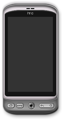
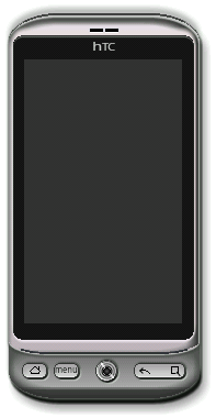
The final phone on a separate page.

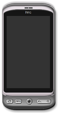
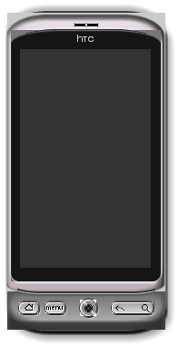
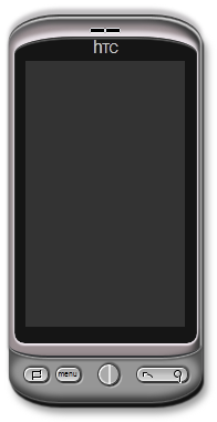
And another comparison:

  • Firefox 4 betaLooks best - I used it while developing.
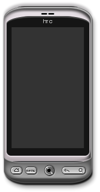
  • Firefox 3.6.13 Border smoothing is missing.
  • Opera 11Gradients missing. Minimum font-size override. Small border-radius by percentage buggy.
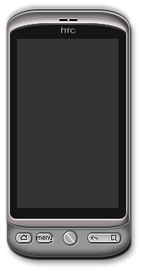
  • Safari 5.0.3 (Win)Border smoothing and percentages in border-radius are missing. Tiny border radius (earpiece) ignored.
  • AndroidBorder smoothing, box shadows with zero blur, and percentages in border-radius are missing. Tiny border radius (earpiece) ignored
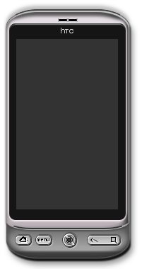
  • Chrome Dev (10.0.648.11)Border smoothing is missing. Tiny border radius (earpiece) ignored.
  • Chrome Stable (8.0.552.237)Border smoothing and inset box shadows are missing/broken. Tiny border radius (earpiece) ignored.
  • IE9Gradients, transforms & transitions, and text-shadow missing.
  • IE8It's kind of cute :)

Ok, that's enough now :)

Previously: Part 1, Part 2.

Leave Your Comment

Your email will not be published or shared. Required fields are marked *

You may use these HTML tags and attributes: <a href="" title=""> <abbr title=""> <acronym title=""> <b> <blockquote cite=""> <cite> <code> <del datetime=""> <em> <i> <q cite=""> <s> <strike> <strong>